 Phlox Text Element?allows you to represent your content better than before.
You can add things together with the help of this element of Page Builder. This element can include a title, text, an image or icon, and even the combination of them. There are many ways to use the text element. Depends on the content, you are able to add as many text elements as you want.
Follow below steps to add Phlox Text Element in your post or page content:
- Go to your WordPress Admin Panel
- Click the Pages?on the Dashboard
- Click the Add New
- Navigate to the top right hand of the WordPress editor and find Page Builder, beside text tab
- Click?the?Add Widget
- Click the?Phlox?and choose?Text
- Click the?Edit?on the right side of the widget on?Page Builder
Recommended: To see the demos of?Text Element, check out this link.
Text Element Features
Title
Adding a title for your text element is optional.
Subtitle
The subtitle is the second title which appears below the title and it is optional, too.
Title Link
Your title can be linked to another website. Copy the URL of your desired website in this field.
Wrapper Style
Wrapper styles can be Simple, Outlined, and Boxed.
Text Align
There are three text alignment for the text: Left, Center, Right
Text Color Scheme
You can choose two different text color schemes: Light and Dark
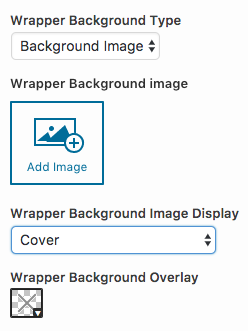
Wrapper Background Type
Wrapper background can be either Single Color or Background Image.
By choosing Background Image for the wrapper, you can add an image and display it as Cover, Tiled Image, Centered (with original size), and Fixed.
This background image can have an overlay color, too.
Wrapper Background Color
Here you are able to choose a background color for the wrapper of the text element.
Header Background Type
Like wrapper background, header background can be a Single Color or Background Image.
The background image can be display as Cover, Tiled Image, Centered (with original size), and Fixed.
Display Icon or Image
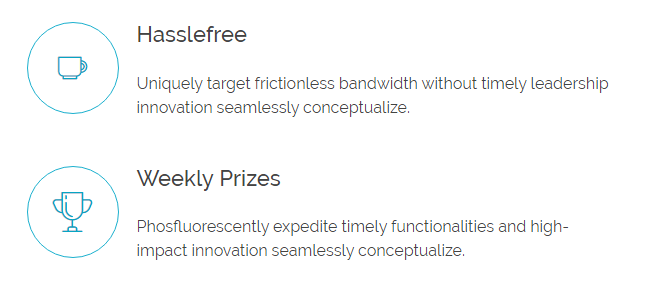
You are able to add icon or image to your text. Also, it is possible to use both of them at the same time.
– Icon
Either you choose icon or image, you will see this section. You can choose an icon from almost 1000 available icons.
- The below options will appear, when you select?Display Icon:
1. Icon Color
The color of the icon is changeable.
2. Icon Size
You can specify the Icon size. It can be Small, Medium, Large, X-Large.
3. Icon Background Color
You can choose a background color for the icon.
4. Icon Outline Color
The border around the icon can be colorful.
5. Icon Background Shape
The icon can be displayed in different shapes. Available shapes are: Circle, Semi-circle, Round Rectangle, Cross Rectangle, Rectangle
– Image
You can use an image instead of icon, or use both of them, but when you select image, you are not able to see the five above mentioned options ?(icon color, icon size, icon background shape, icon background color, and icon outline color.)
After selecting image, you will see the below options:
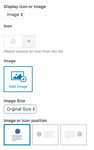
With Add Image?you are able to upload an image or select one from your media library.
Image Size
You can display image in whatever size you want: Original Size, Large, Medium, Thumbnail
Image or Icon Position
The image or icon can be at the top, left, or right side of the text.
Fill Background Color
This option will apply a background color for the icon.
Display Button
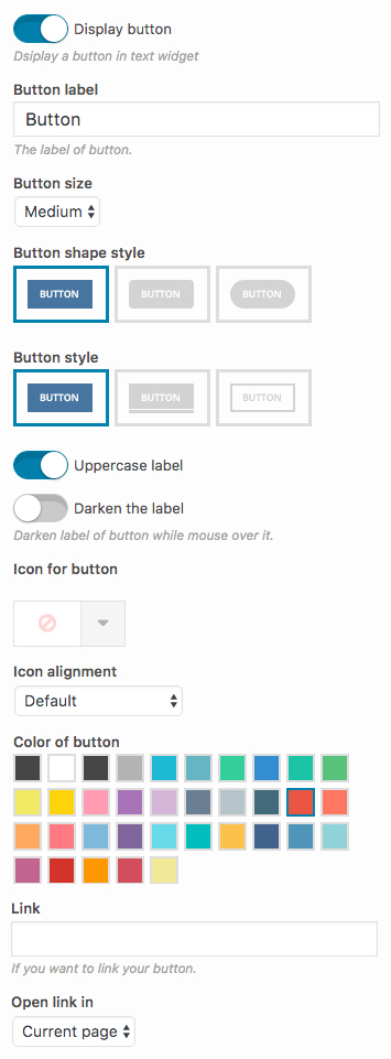
To add a button to the text block, enable Display button. Then, the below options will appear:
Button Label
Give your button a label in this section.
Button Size
Here you can set the size of button. You can pick from Exlarge, Large, Medium, Small, Tiny
![]() ?
?![]() ?
?![]() ?
?![]() ?
?![]()
Button Shape Style
There are three available shapes for the button.?Box, Round, Curve
![]() ?
?![]() ?
?![]()
Button Style
Make your button even more stylish with three different styles: Normal, 3D, Outline
![]() ?
?![]() ?
?![]()
Uppercase Label
This option can be used to make the label of button appear in all-uppercase.
Darken the Label
In the case of a light colored button, like white, you can switch on this option to darken the label of button.
Icon for Button
You can choose an icon from almost 1000 available icons. for your text.
Icon Alignment
You are able to align the button icon to:
| ?Icon Alignment | ?Icon Alignment Preview |
|---|---|
| ?Left | ? |
| ?Right | ? |
| ?Over | ? |
| ?Animate from Left | ? |
| ?Animate from Right | ? |
Color of Button
This option specifies the color of the button.
Link
If you want to link your button to another page, you can write the URL in this field.
Open Link in
You can either open the link in the current page or in the new page.
Recommended: To see the buttons demos, check out this link.
Note: Here you can find the common?styles of widgets in Page Builder.
Content
Add your text content in this field.
?Footer Shape
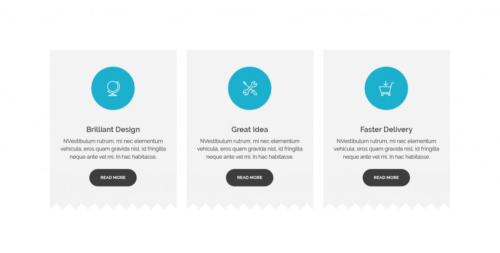
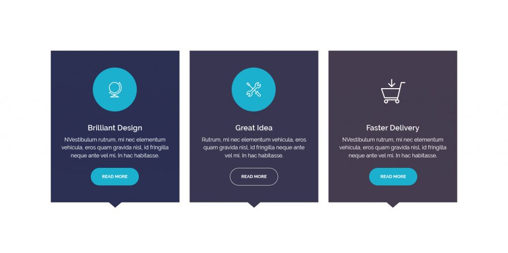
The bottom of the text block, can have different shapes:
You can keep it simple by selecting?None. Also, you are able to choose a color for this footer.
Extra Class Name
By adding a class name of the style you have written in your CSS file, you can change the style of?text element.

