
Image Hover
Phlox Image Widget gives you the possibility to upload an image or a number of images in any widget area you want.
There is no limit to the number of image widgets you add and you can also upload a second image to each image widget that shows up after the user hover over the image.
Follow below steps to add Phlox Image?to a widget area or in a page content in widget area:
- Go to your WordPress admin panel
- Click?Appearance on the Dashboard
- Then click?Widgets
- Find [Phlox] Image?among the available widgets and add it to your desired Widget Area

Image Lightbox
Access Advanced Image Options in Elementor Page Builder
- Go to your?WordPress Admin Panel
- Click the?Pages?on the?Dashboard
- Click the?Add New
- Navigate to the top left hand of the WordPress text-box and find?Edit with Elementor?button.
- Check out?Elements
- Scroll down to?PHLOX PRO ? GENERAL?section
- Choose?Advanced Image
-
Content

Image
You can add your image to this section. The available?Image Sizes?are: Thumbnail – 150 x 150, Medium 300 x 300, Medium Large 768 x 768, Large 1024 x 1024, Post-thumbnail 280 x 180, Full,?and Custom
Image link is settable. You are able to click the gear icon to see the options: Open in new window or Add nofollow.
Hover Image
Besides the image, it is possible to add a second image that will be appear when the mouse is hovering over the image.
Ribbon
Another option is adding a?Ribbon?to your image. The text of this badge is changeable. Also, there are three available styles: Simple, Corner, and Cross
You can change the ribbon position and align it to?Top Right,?Top Left,?Bottom Right, and?Bottom Left
Ribbon Thickness can be changed in PX or EM. Maximum possible value is 50px (3EM)
-
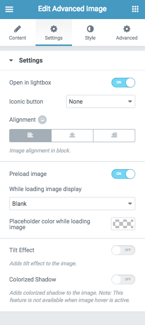
Settings
To open image in lightbox, enable?Open in lightbox. It can be specified by a Plus?iconic button.
Image?Alignment?in block can be?Left,?Center, or?Right
Dark?and?Light?are the two available player skins.
Enable?Preload Image, so it add a loading animation while loading the image. The available effects are: Blurred placeholder image,?In-progress box animation, and?Loading spinner in Blue, Light,?or?Dark
If you leave it blank, an option will be available to set a color for the placeholder while loading image.
Tilt Effect
Colorized Shadow adds a shadow of the image below it.
Style
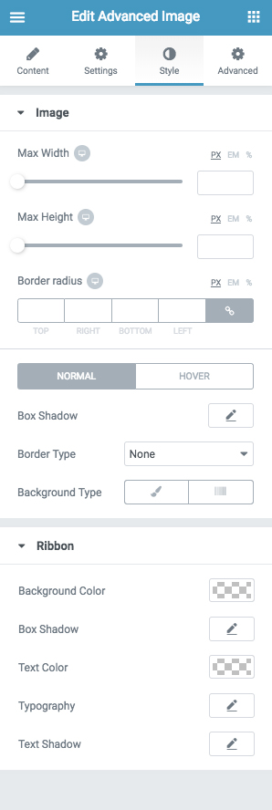
Image
You can set max width/height to your image, or give rounded corners by adding Border Radius.
Besides, it is possible to apply?Box Shadow?and?Solid, Double, Dotted, Dashed, or Groove?Border to your image.
Background Type?option lets you add a background image or background color/gradient to your element. You are able to change the position of background image to?Top Left,?Top Center,?Top Right,?Center Left,?Center Center,?Center Right,?Bottom Left,?Bottom Center,?Bottom Right, or?Custom (X Position, Y Position). The background image can be?Fixed?or?Scroll and it can be repeated.?Also, you can change its size to?Auto,?Cover,?Contain, or?Custom.
Ribbon
Background Color?of the ribbon or badge is customizable. There are some options to change the style of?Box Shadow?and?Typography.
Recommended: Check out this article to know more about Advanced tab and start working with Elementor.
Access Advanced Image Options in SiteOrigin Page Builder
- Go to your WordPress Admin Panel
- Click?Pages?on the Dashboard
- Click?Add New
- Navigate to the top right hand of the WordPress editor and find Page Builder, beside text tab
- Click?Add Widget
- Click?Phlox?and choose?[Phlox]?Image
- Click?Edit?on the right side of the widget on?Page Builder
Title
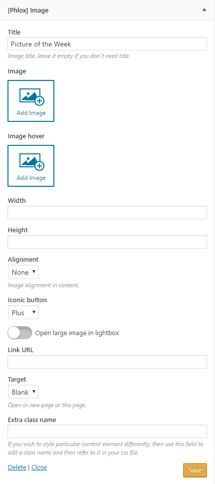
In this section, you can give your image a title.
Image
Easily click?Add Image?to add an image to your desired widget area.
Image Hover
Whenever you hover over the first image you have added, this?second image will show up.
Width and Height
Here you can specify the images’ width and height.
Alignment
You can align the images according to the widget area.
Open Large Image in Lightbox
-
Iconic button
By switching on this option, the image (not the hover) will enlarge in a lightbox.?If you want to add a plus icon on the image whenever you hover over it, change it to plus.
Note: After enabling this option, next options will be disabled.
Link URL
If you want the image to link to another page, add the page’s URL in this field. After clicking the image, the page that you have linked?opens.
Target
You can choose the image opens in the new page or in the current page.
Extra Class Name
In order to customize particular content element, write the style on your CSS file with a class name, then add the class name in this field.
