One of the elements of Phlox Elements plugin is?Gallery widget.?Your images can be displayed in a gallery which is customizable.?You can specify the gallery layout and change its style or even columnize the images.
Recommended: You can find gallery demos here.
Follow below steps to add?Gallery Widget?in your posts and pages content.
Access Modern Gallery Options in Elementor Page Builder
- Go to your WordPress Admin Panel
- Click the Pages?on the Dashboard
- Click the Add New
- Navigate to the top left hand of the WordPress text-box and find?Edit with Elementor?button.
- Check out?Elements
- Scroll down to?PHLOX – General?section
- Choose Modern?Gallery
After adding modern gallery to your post or page, you are able to customize it by available options:
-
Content
Gallery Images
You can select the images you want to appear in the gallery by clicking on?ADD IMAGES?button.
Gallery Layout
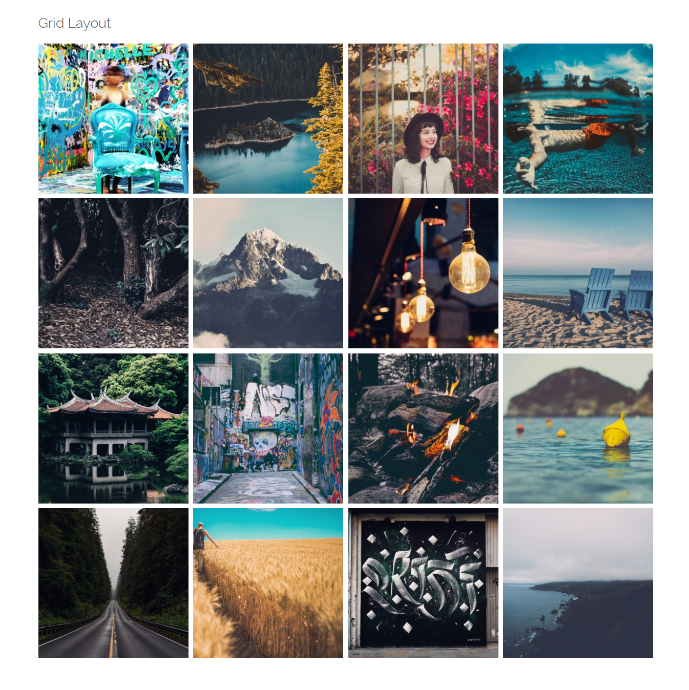
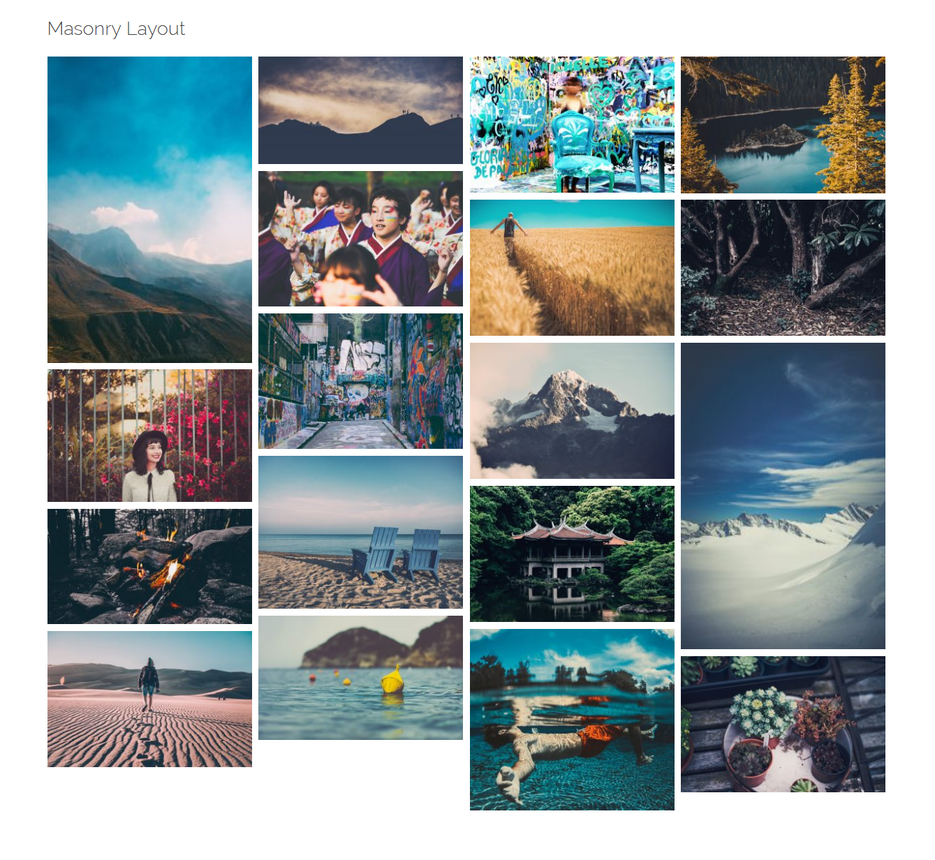
There are three available layouts: Grid, Masonry, and Tiles

Columns
On Grid and Masonry galleries, you are able to change the number of columns up to 6 columns. Also, you are able to change the column numbers on mobile and tablet.
Image Spacing
Like the previous option, on Grid and Masonry layouts. You can change the values from 0 to 40 pixels.
Image Aspect Ratio
This option is only available for Grid layout. You can change it from 0.1 to 2.
Link to
Your images can be linked to Media File, Attachment Page, Lightbox, or you can simply choose no link for them.
Pagination
You can add pagination to your gallery and change the two following options:
Enable Lazyload
This option is suitable for long webpages.?Images outside of viewport will not be loaded before user scrolls to them.
Images per Page
You can show up to 100 images per page.
Order by Query
After you enable this option, you can change the images order:
Order
You can order them either ascending or descending.
Order by
- Date: Order the posts by their publication date
- Menu Order:?Order by page order
- ID:?Order by post ID
- None
-
Style
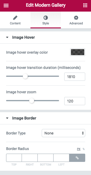
Image Hover

You can choose a color for the image hover overlay. Also, you are able to change the hover transition duration in milliseconds. The space around of the image can be increased after hovering with increasing image hover zoom.
Image Border
If you add an image border, it can be?Solid,?Double,?Dotted,?Dashed, and?Groove. Besides, you can change the width and color. Or add a?Border Radius?in pixels.
Recommended: Check out this article to know more about Advanced tab and start working with Elementor.
Access Gallery Options in SiteOrigin Page Builder
- Go to your WordPress Admin Panel
- Click?Pages?on the Dashboard
- Click?Add New
- Navigate to the top right hand of the WordPress editor and find Page Builder, beside text tab
- Click?Add Widget
- Click?Phlox?and choose?[Phlox]?Gallery
- Click?Edit?on the right side of the widget on?Page Builder
After adding gallery to your post or page, you are able to customize it by available options:
Title
Writing a title for the gallery is optional.
Images
To select the images of your gallery, you can Add Images one by one, or hold the ctrl key and select the images you want to add to the gallery.
Gallery Layout
Choose the way you want your images to appear in the gallery. They can be in a?Grid?gallery or?Masonry gallery.
Order
Here you are able to order the images either ascending or descending.
Order by
- Date: Order the posts by their publication date
- Menu Order:?Order by page order
- ID:?Order by post ID
- None
Column Number
The images can be shown in columns. You can specify the number of columns (up to 6) or change the number of columns on smaller screen sizes.
Space
The space between images is changeable in pixels.
Image Aspect Ratio
You can change image aspect ratio to: ?Horizontal 4:3, Horizontal 16:9, Square 1:1, and Vertical 3:4
Link Images to
You are able to choose what happens when you click the images.They can open in a Lightbox?or in WordPress Attachment Page. Choose?None?if you want nothing to happen, and if you want to?open images in the original size, select?File.
Image Size
This option determines the size of the images. Different image sizes are as follow: Original, Large, Medium, Small, Thumbnail
Our Recommendation is Large-sized for 2 column gallery, Medium for 4 column gallery, and Thumbnail for more than 4 columns.
Images Per Page
You can specify?the number of images per page.
Extra Class Name
This field lets?you customize the widget. Write a style on?your CSS file, then add the defined class name here.


