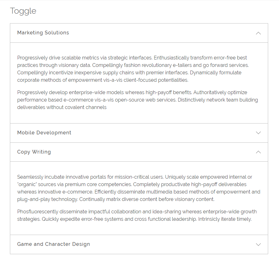
With Phlox?Accordion Widget, you can create multiple section in a vertical list box. The sections or elements come with label and content.?Each section is expandable and by clicking on the section title, the content will be displayed.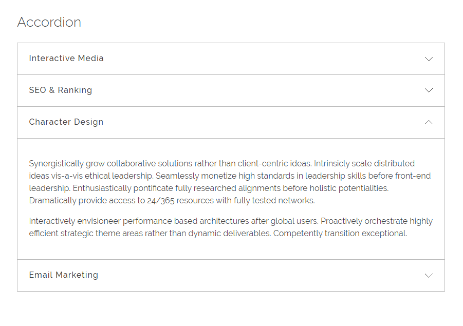
Follow below steps to add Phlox Accordion Widget?to a widget area or in a page content:
- Go to your WordPress admin panel
- Click on the Appearance on the Dashboard
- Then click on the Widgets
- Find [Phlox] Accordion?among the available widgets and add it to your desired Widget Area
Video Tutorial
 Access Accordion Options in Elementor Page Builder
- Go to your WordPress Admin Panel
- Click the Pages?on the Dashboard
- Click the Add New
- Navigate to the top left hand of the WordPress text-box and find?Edit with Elementor?button.
- Check out?Elements
- Scroll down to?PHLOX – GENERAL?section
- Choose?Accordion
After adding accordion to your post or page, you are able to customize it by available options:
-
Content
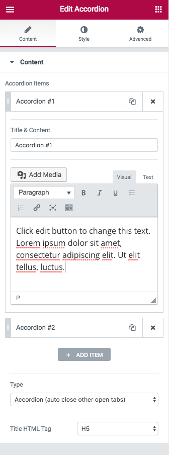
Accordion Items
This section lets you add, duplicate, or remove an accordion item. After that, you can select the accordion item you want and change its Title & Content.
Type
There are two types of accordion: Accordion (auto close other open tabs) and Toggle
Accordion expands the sections one at a time and?when you open a new section, the previous one will be closed.
Toggle, however, can expand all the sections without closing any of them.
Title HTML Tag
With this option, you are able to change the title from H1 to H6. It can be div or section, too.
-
Style
Title Bar
You can change many options on this section. When you hover over title bar, your Mouse Curser can be Default, Pointer, Zoom, and Help.
Paddings, Margins, and Border Radius can be changed. Also, you can set different paddings and margins on mobile and tablet.
Box Shadow and Border Type of title bar has different settings. This section lets you change these on Normal, Hover, or Selected mode. Width and Color are editable and Background Type can be Classic or Gradient.
Title
You can change the Color and Typography?of the title on Normal or Hover.
Content
Many options are available here that let you change Typography, Color, Paddings, Margins, Border Radius, Size and Position of accordion content. Besides, you can set a Background for your content.
Recommended: Check out this article to know more about Advanced tab and start working with Elementor.
 Access Accordion Options in SiteOrigin Page Builder
- Go to your WordPress Admin Panel
- Click the Pages?on the Dashboard
- Click the Add New
- Navigate to the top right hand of the WordPress editor and find?Page Builder, beside text tab
- Click?the?Add Widget
- Click the?Phlox?and choose?[Phlox]?Accordion
- Click the?Edit?on the right side of the widget on?Page Builder
After adding accordion to your post or page, you are able to customize it by available options:
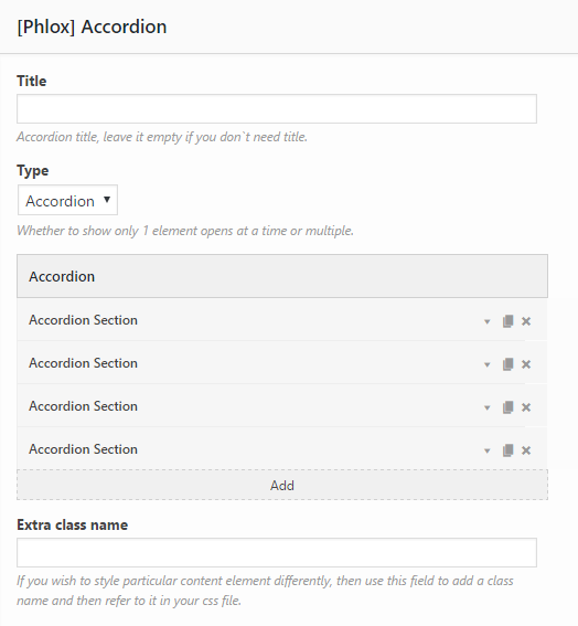
Title
Add a title to the whole accordion,?if you want the widget to appear with a title.
Type
This element has two types: Accordion and Toggle
Accordion expands the sections one at a time and?when you open a new section, the previous one will be closed.
Toggle, however, can expand all the sections without closing any of them.
Extra Class Name
In this field, you can add a class name that you have written?on your CSS file before.
Add or Delete a Section
You can simply add any number of items you want. Then you are able to duplicate each item, or easily swap them with drag and drop. Also, the items can be deleted.
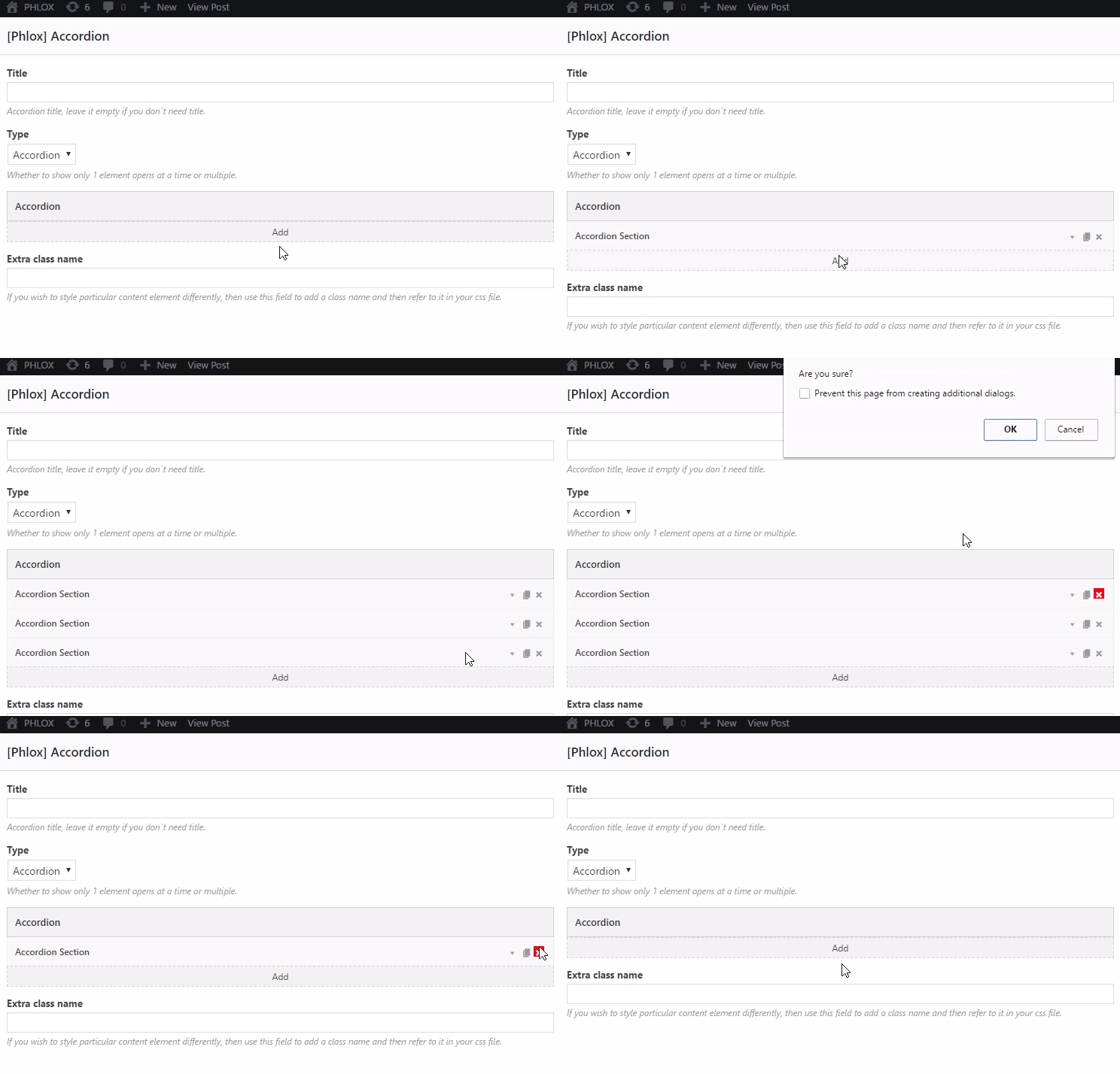
Add Label and Content to a Section
Each section can has its specific label and content.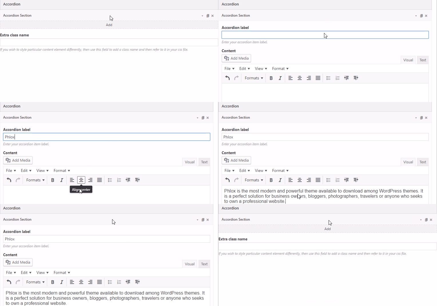
Accordion Label
Here you can choose a label or title for the section.
Content
In the textbox you can write the content you want to show when you click the label.
Note: Here you can find the common?styles of widgets in Page Builder.


