 You can add up to two buttons to Phlox header.?Header Button?is available in different sizes and various styles. Also, you can add an icon to your button or even link the button to anywhere you want.
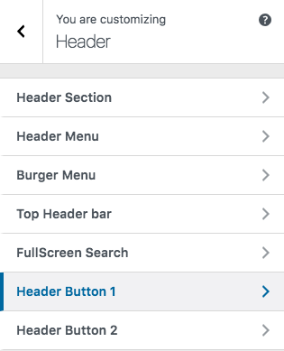
To find the related options, follow below steps:
- Go to your?WordPress Admin Panel
- Click?Appearance?on the?Dashboard
- Then click?Customize
- Navigate?Header > Header Button 1, 2
Header Button Options
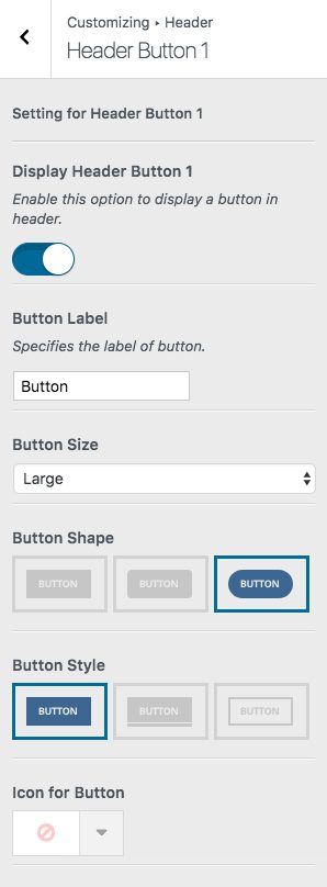
Display Header Button 1
Here you can enable this option to display a button in the header. If you want to add two buttons, go back and select Header Button 2.
Button Label
Choose a name for your button on this section.
Button Size
Each button can have different sizes: Ex-large, Large, Medium, Small, Tiny
 ?
? ?
? ?
? ?
?
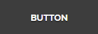
Button Shape
The shape of the button can be changed to Box, Round, Curve
 ?
? ?
?
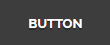
Button Style
Buttons can appear in three styles: Normal, 3D, Outline
 ?
? ?
?
Icon for Button
There are almost a thousand available icons to use on the button.
Icon Alignment
You are able to align the button icon to:
| ?Icon Alignment | ?Icon Alignment Preview |
|---|---|
| ?Left | ?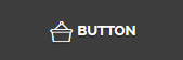 |
| ?Right | ?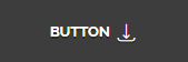 |
| ?Over | ? |
| ?Animate from Left | ? |
| ?Animate from Right | ? |
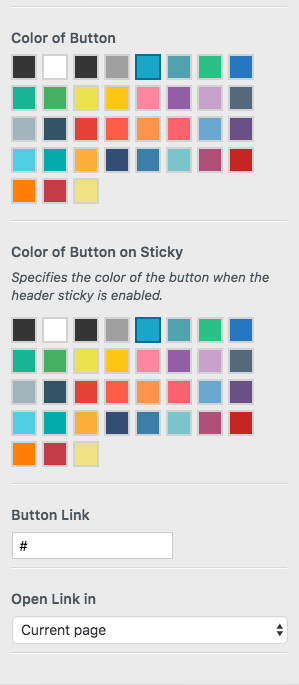 Color of Button
This option specifies the color of the button. To see all available colors for Phlox button, check out this page.
Color of Button on Sticky
On sticky header mode, the button’s color can be different to its original color.
Link
If you want to link your button to another page, you can write the URL in this field.
Open Link in
You can either open the link in the current page or in the new page.
Recommended: To see the buttons demos, check out this link.