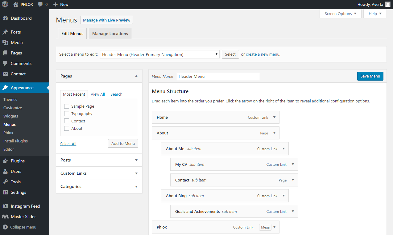
 Phlox provides additional features?for Navigation and Menu. These options?include three menu locations, different navigation types such as burger menu with different styles, mobile menu for smaller screen sizes, and megamenu which?displays multiple columns of menu items inside one?sub-menu.
These options can be managed through WordPress menu settings page, besides, you can find many other navigation styling options in WordPress customizer.
Video Tutorial
Recommended: To know how to?create a menu and be familiar with menu structures,?you can find useful information here.
Additional Menu Options

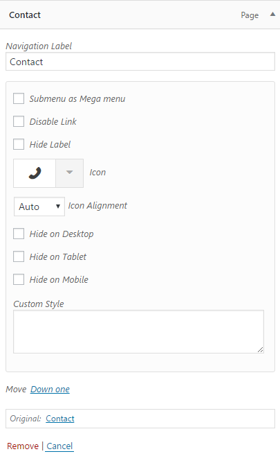
In the WordPress menu page (Dashboard > Appearances > Menu) you can simply expand the item to find these additional options.
- Submenu as Megamenu: Check this option to transform the classic?submenu to a megamenu layout.?(Check out this article?to read more.)
- Disable Link:??This option removes the link of the menu item.
- Hide Label:?This option removes the label of navigation (the name). It is useful when you want to have only an icon for your navigation.
- Icon:?This option adds an icon beside the menu item.
- Icon Alignment:?You can change the alignment of the icon by this option. There are four positions: left, right, top, and bottom.

Left Alignment

Right Alignment

Bot Alignment

Top Alignment
- Hide on Desktop:?Check this option to hide the?menu item on desktop devices.
- Hide on Tablet:?Check this option to hide the menu item on tablets.
- Hide on Mobile:?Check this option to hide the menu item on mobiles.
- Custom Style:?This option is for those who want to write a custom CSS style.
