Use Divider shortcode to separate the content in a stylish way. You can add the divider shortcode, select your desire style, then fill in its attributes. Available options will be explained below.
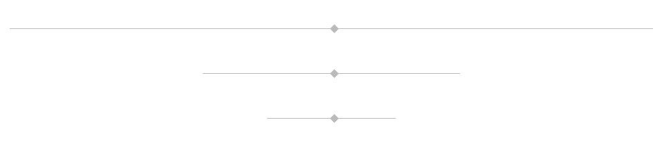
Divider Sizes
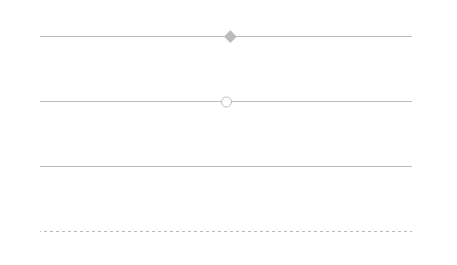
Divider Styles
[aux_divider width="medium" style="solid" margin_top="20" margin_bottom="20" extra_classes=""]
Recommended: To see the demos of Divider, check out this link.
| OPTION | DEFAULT VALUE | VALUES AND DESCRIPTION |
|---|---|---|
| style | “solid” | “white-space”
“solid” “dashed” “circle-symbol” “diamond-symbol” |
| width | “medium” | Specifies the width size of divider.
“large” “medium” “small” |
| margin_top | ” “ | Adds space above the divider (in pixels). |
| margin_bottom | ” “ | Adds space below the divider (in pixels). |
| extra_classes | ” “ | Add your custom CSS class names here, to style particular content element differently. |