Use Button shortcode to create various kinds of buttons. You can add the button shortcode, select your desire style, then fill in its attributes. Available options will be explained below.
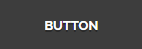
Normal
[aux_button label="Button" size="medium" icon_align="left" color_name="dark-gray" border="" style="" icon="fa fa-beer" link="" target="_blank"]
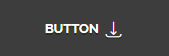
3D
[aux_button label="Button" size="medium" icon_align="left" color_name="dark-gray" border="" style="3d" icon="fa fa-beer" link="" target="_blank"]
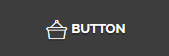
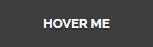
Outline
[aux_button label="Button" size="medium" icon_align="left" color_name="dark-gray" border="" style="outline" icon="fa fa-beer" link="" target="_blank"]
Recommended: To see the demos of Button, check out this link.
| OPTION | DEFAULT VALUE | VALUES AND DESCRIPTION | Demo |
|---|---|---|---|
| label | “Button” | The written name appears on the button. | |
| color_name | “dark-gray” | To see all available colors on Phlox button, check out this page. |  ? ? ? ? ? ? ? ? ? ? |
| size | “medium” | Specifies the button size.
“exlarge” “large” “medium” “small” “tiny” |
|
| border | ” “ | Changes the border of the button.
” “: Box “round” “curve” |
|
| icon_align | “left” | Aligns the icon of the button.
“left” “right” “over” “left-animate”: Animate from left “right-animate”: Animate from right |
|
| style | ” “ | Changes the button style.
” “: Normal “3d” “outline” |
?
|
| icon | “fa fa-beer” | Lets you choose any icon you want. Check out the list of icons here. | |
| link | “title” | Links the button to another web page. | |
| target | “_blank” | “_blank”:?Open link in a new page
“_self”: Open link in current page |
|
| extra_classes | ” “ | Add your custom CSS class names?here, to style particular content element differently. |

