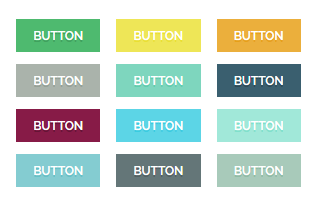
 A?Button Widget?can be added to any post or page on your website. You are able to create different kinds of buttons and customize the?button size, shape, style, etc.
Recommended: One more way to add a button to the posts or pages, is adding a shortcode.?Read this article to find out more information.
Video Tutorial
Access Button Options in Elementor Page Builder
- Go to your WordPress Admin Panel
- Click the Pages?on the Dashboard
- Click the Add New
- Navigate to the top left hand of the WordPress text-box and find?Edit with Elementor?button.
- Check out?Elements
- Scroll down to?PHLOX – General?section
- Choose Button
After adding a button to your content, you are able to customize it by available options:
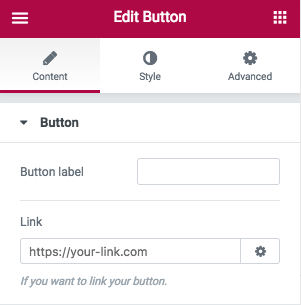
Button
Write a name for your button on Button label.
Link
You can add a link to your button.

-
Style
General
Button widget has some general options. You can change the?Color of button?or its Size.
Also, there are three available shapes:?Box, Round,?and?Curve? and three styles😕Normal, 3D,?and?Outline
Icon
In this section, you are able to select an icon for your button. The alignment of the selected icon can be set to?Left, Right, Over,?and?Animate from Left or Right.?The?Color?is customizable, too.?Padding properties are used to generate space around?the icon and?you can set different paddings on mobile and tablet.
Text
The button text is editable and you can change its?Color?and?Typography. Also, you can change its?Padding.
Recommended: Check out this article to know more about Advanced tab and start working with Elementor.
Access Button Options in SiteOrigin Page Builder
Follow below steps to add Button?Widget?in your posts and pages content:
- Go to your WordPress Admin Panel
- Click the Pages?on the Dashboard
- Click the Add New
- Navigate to the top right hand of the WordPress editor and find Page Builder, beside text tab
- Click?the?Add Widget
- Click the?Phlox?and choose?[Phlox]?Button
- Click the?Edit?on the right side of the widget on?Page Builder
After adding a button to your content, you are able to customize it by available options:
Button Label
In this field, you can add a label for your button.
Button Size
Each button can have different sizes: Ex-large, Large, Medium, Small, Tiny
![]() ?
?![]() ?
?![]() ?
?![]() ?
?![]()
Button Shape Style
The shape of the button can be changed to Box, Round, Curve
![]() ?
?![]() ?
?![]()
Button Style
Buttons can appear in three styles: Normal, 3D, Outline
![]() ?
?![]() ?
?![]()
Uppercase Label
To uppercase all the label’s characters, switch this on.
Darken the Label
In the case of a light colored button, like white, you can switch on this option to darken the label of button.
Icon for Button
There are almost a thousand available icons to use on the button.
Icon Alignment
You are able to align the button icon to:
| ?Icon Alignment | ?Icon Alignment Preview |
|---|---|
| ?Left | ? |
| ?Right | ? |
| ?Over | ? |
| ?Animate from Left | ? |
| ?Animate from Right | ? |
Color of Button
This option specifies the color of the button. To see all available colors for Phlox button, check out this page.
Link
If you want to link your button to another page, you can write the URL in this field.
Open Link in
You can either open the link in the current page or in the new page.
Recommended: To see the buttons demos, check out this link.
Note: Here you can find the common?styles of widgets in Page Builder.

